
The headline on a recent article in The Palmer Report suggested that its writer had landed a scoop. “Turns out Donald Trump directly sabotaged the U.S. military mission against Baghdadi,” it read. The subsequent analysis piece written by the blog’s founder, Bill Palmer, a self-described political journalist, went on to accuse President Trump of nearly sabotaging the military operation in northern Syrian that targeted and killed Islamtic State leader Abu Bakr al-Baghdadi in October.
But it did so without facts and no original reporting, and just a little digging around on the Internet would have confirmed that, in spite of its growing influence — a lawmaker cited it in a CNN interview — The Palmer Report is a liberal blog that pushes out anti-Trump articles.
As a media analyst for Ad Fontes Media, I regularly am assigned these types of “news” articles to rate them for bias and reliability. There are many things to consider when making these determinations, and it’s no easy task, even for me, as a longtime journalist.
It’s no wonder that the general public has a difficult time in deciding which news sources they should trust, as a recent Stanford University study noted in its examination of media literacy. I, too, have found myself overwhelmed by the various “news stories” flooding my social media feeds. But I know how to verify them. Most readers simply share the articles as fact without following a few simple tips to look at the “about us” section, check comments or do a reverse image search, as media literacy experts have suggested.
Gauging the reliability of a publication is not merely a problem for U.S. news consumers, as GJR associate editor Zahed Arman writes in the fall issue of the magazine. It is an international problem.
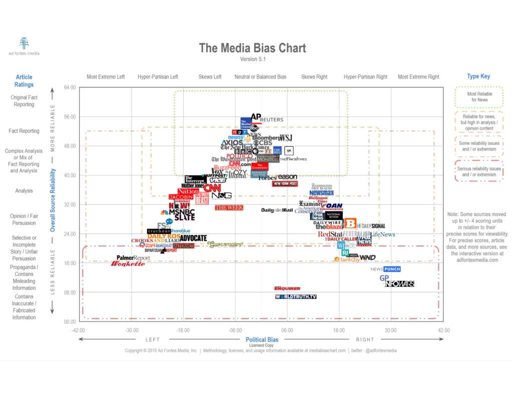
Ad Fontes Media Inc. is an offshoot of the Media Bias Chart created by patent attorney Vanessa Otero from Denver. Ad Fontes means “to the source” in Latin; Ad Fontes looks at the source of the report. Otero was so alarmed by the spread of information from unfamiliar sources during the months leading up to the 2016 presidential election that she used her experience in legal analysis to rate various news sources on their quality and bias.
Otero compared the media landscape to the American food landscape. “We love junk food and we love junk news. And they are both wreaking havoc on our individual and collective physical and mental health, and having detrimental effects on our whole society,” she wrote in explaining Ad Fontes. Otero’s efforts to analyze the media, then, are similar to the nutrition label on our food. “I assert that we should at least have some idea of what we are getting into before putting it into our brains.”
Her Media Bias Chart made an immediate impact and was shared more than 20,000 times on Facebook. Otero received lots of feedback, from those who argued the placement of particular media on the chart to those asking her to rate more and more media sources.
The popularity of her project led Otero to create Ad Fontes Media Inc. in 2018 with the mission of “making news consumers smarter and news media better.” Earlier this year, she launched the first multi-analyst content analysis, employing 20 people who rated 1,800 articles and TV news shows. These analysts represented a variety of backgrounds, from teachers to lawyers to business executives.
I was lucky enough to be chosen to participate. I had been using the Media Bias Chart in my journalism class for a few semesters, so I jumped at the chance to be a part of the process.
From March to June this year, our team of analysts ranging from educators to attorneys to technology workers rated about 370 articles and 17 TV news shows each. Each article and TV show was rated on its “quality” and “bias” by at least three analysts with different political views (right, left and center). This was designed to minimize the impact of the analysts’ personal biases on the results.
The “bias” rating, demonstrated on the Media Bias Chart on the horizontal axis, ranges from most extreme left to neutral to most extreme right. The “quality” rating (which has now been renamed “reliability”), demonstrated on the chart’s vertical axis, rates sources on a scale from original fact reporting to analysis, opinion, propaganda and inaccurate/fabricated information.
The results of our in-depth content analysis were published in August as an Interactive Media Bias Chart, version 5.0 from Otero’s original. (The interactive chart is 5.0. The static chart has been updated and is now version 5. 1). This interactive version allows you to read the articles that were analyzed and to view specific media sources individually to see where they appear on the chart.
As analysts, we consider a variety of factors when rating a news article. Although we rate sources independently, regular conference calls allow us to share our thoughts and experiences, and Otero has used this feedback to adjust the process in order to gain the most accurate and useful results.
To determine its reliability score, we consider the article’s veracity (Is it true and easily provable? False and easily disprovable? Subject to debate?) and expression (Is it presented as fact, opinion or some combination of those?). And we consider the article’s headline and graphics (i.e., are they truthful or misleading?). We add each of these scores to the chart on a sliding scale, with the average of those creating the article’s overall reliability score.
To determine an article’s bias score, we consider its language (Are there personal attacks? Does it use partisan political terminology such as “snowflakes” or “deplorables”?) and its political position (Is it neutral or does it represent the talking points of a particular political party?). Finally, a comparison score is considered, based on how this article presents information compared to other stories from other sources on the same topic. We add each of these scores to the chart on a sliding scale, with the average of those creating the article’s overall bias score.
The media sources rated most reliable and least biased, then, appear at the top and center of the chart.
So, where did that Palmer Report article rate on the chart? With few facts, unsupported opinions and an accusatory headline, it was rated on the line between ”opinion/fair persuasion” and “selective or incomplete story/unfair persuasion” on the reliability scale. Calling President Trump “obnoxious and borderline maniacal” and displaying liberal viewpoints in comparison with other articles on the topic, it was rated “hyper-partisan left” on the bias scale.
With a constantly changing media landscape, our work is not done. The content analysis continues, as a team of nine rates articles each week. Media sources are added to the chart regularly (The Independent, Newsweek, CNBC, Epoch Times and The Root will be added soon). Version 5.1 of the static chart, with better visibility of media sources, was released in early November.
Like me, Ad Fontes analyst Steven Specht first became involved with the Media Bias Chart when he used it with his students at the University of Florida. “I was very frustrated at the quality of articles turned in by students during current event assignments,” he said. He uses the Media Bias Chart for students to do a self-assessment of their top five sources based on their placement on the chart and then made a rule that sources needed to come from the green box at the top of the page.
His work as an analyst to help determine the placement of those sources on the chart, Specht said, has been a learning experience for himself, as well. He shares his experiences as a media analyst in his blog at stevenspecht.com.
“I have enjoyed learning about new sources and about the dirty tricks used by some organizations to make their articles appear better than they really are, and I think that we are slowly devising a ‘best practices,’ so to speak, as a result of that.”
Mary Ann Taylor, a blogger and college English teacher in Dallas, seized the opportunity to be a media analyst after a post about media bias led her to the Ad Fontes chart.
“Although I read fairly widely, I was not reading broadly. News sources are more diverse than I realized,” she said. “Yes, there is often clear bias, but there is also more fact reporting in a variety of places.”
Otero has described her work as helping people to become “info fit.” “If more people choose to become info fit, we can make a difference in our politics and in our personal relationships with our fellow citizens,” she said.
To make progress toward this goal, Ad Fontes has launched its new Content Analysis Rating Tool (CART) Media Literacy Software. This allows educators teaching junior high through college to train students how to rate news articles using the same tools as our team of analysts. The students are able to compare their results with ours as they become increasingly media savvy. The first subscriber will begin using the software in January.
“Ad Fontes may be on the cutting edge of educating a new generation to think independently, no small task and potentially a way forward to save us all,” Taylor said.
Beth Heldebrandt is an adjunct journalism professor and library public relations director at Eastern Illinois University. She was a newspaper editor for more than two decades.